圆环型进度条
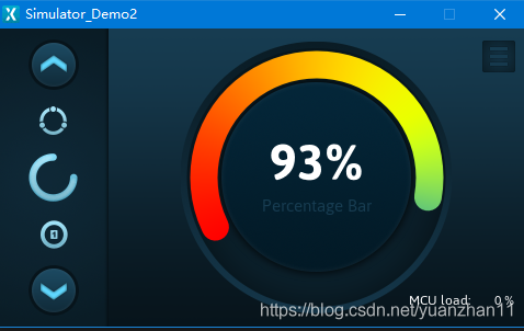
好久没更新了,之间主要是为了之后的更新在准备一些demo,这期主要给大家介绍一个例子,这个例子很小但是能说明 一些TouchGFX的开发细节。话不多说先上图。

这期主要给大家介绍这个圆环进度条。
制作原理
这个 看起来感觉很高大上的进度条,其实组成原理分为几个部分。
首先先注意下这个界面,这个界面是touchGFX官方提供的demo中的一个画面,其中左侧的滑动栏主要作用是用于切换右侧的界面,这里我们不过多讲解。再看下整体通过touchGFX搭建的界面。

这个界面上并没有圆环的内容,但是右侧有一个底图背景background,这个image定义了界面的主色调,这样开发这个控件时主要的大背景颜色也应该类似,如果跳脱了那就只能说明丑!!!
既然控件不是通过designer去实现的,那只能说明该部分的内容可变动的地方过于多。所以需要通过代码实现,下面我们想一下这个控件的制作过程。
首先在touchGFX中制作控件需要有一个类Container,这个类之前提过这里就不过多说明了。重载这个类后需要一个背景图片,还需要一个前景图片,这两个图片的色调要和大背景相互吻合。

背景图

前景图
除此之外,也需要圆环的部分,第一圆环需要根据百分比的数值进行变动,第二也可以通过手动进行滑动,如果用图片制作那么会加大繁琐程度也不会有太好的效果。这里我们想到touchgfx官方提供的画圆的工具Circle类,这个类继承的是画图及画布的部分,这样就需要一个画出色彩斑斓的画笔去画圆。 那这个画笔的颜色如下图

通过这个画笔则可以制作出相应的圆环。
到这里总结下之前的思路,首先需要两个图片一个做前景一个做背景,还有需要一个圆环,一个画笔,其余就是需要滑动事件,及控件窗口。
到这里有人会问,这么简单就制作一个控件吗,其实大多数控件都可以分解为简单的部分。通过简单的搭建可以做出复杂的效果,千里之行始于足下嘛。下面看下制作流程吧。
制作流程
首先创建个控件类。
- class CircularProgress : public Container
- {
- }
在类中添加内容
- class CircularProgress : public Container
- {
- public:
- CircularProgress();
- virtual ~CircularProgress();
- int getValue()
- {
- return currentPercentage;
- }
- void setBarAngle(int angleInDegrees);
- virtual void handleClickEvent(const ClickEvent& evt);
- virtual void handleDragEvent(const DragEvent& evt);
- protected:
- static const int END_DEGREE = 116;
- static const int START_DEGREE = -END_DEGREE;
- Image background; 背景
- Image centerImage; 前景
- Circle bar; 圆环
- #if !defined(USE_BPP) || USE_BPP==16
- PainterRGB565Bitmap bitmapPainter; 画笔
- PainterRGB565 colorPainter;
- #elif USE_BPP==24
- PainterRGB888Bitmap bitmapPainter;
- PainterRGB888 colorPainter;
- #elif defined(LCD8BPP_ABGR2222)
- PainterABGR2222Bitmap bitmapPainter;
- PainterABGR2222 colorPainter;
- #elif defined(LCD8BPP_RGBA2222)
- PainterRGBA2222Bitmap bitmapPainter;
- PainterRGBA2222 colorPainter;
- #elif defined(LCD8BPP_BGRA2222)
- PainterBGRA2222Bitmap bitmapPainter;
- PainterBGRA2222 colorPainter;
- #elif defined(LCD8BPP_ARGB2222) || USE_BPP==8
- PainterARGB2222Bitmap bitmapPainter;
- PainterARGB2222 colorPainter;
- #elif USE_BPP==4
- PainterGRAY4Bitmap bitmapPainter;
- PainterGRAY4 colorPainter;
- #elif USE_BPP==2
- PainterGRAY2Bitmap bitmapPainter;
- PainterGRAY2 colorPainter;
- #else
- #error Unknown USE_BPP
- #endif
- TextAreaWithOneWildcard percentageText;
- Unicode::UnicodeChar percentageTextBuffer[5];
- TextArea headlineText;//文字
- int currentPercentage;
- void updateBar(int newX, int newY); 位置
- };
之后看一下整体的组合。
- CircularProgress::CircularProgress()
- {
- setTouchable(true);
- background.setBitmap(Bitmap(BITMAP_CONTROLS_WHEEL_BACKGROUND_ID));
- background.setXY(0, 0);
- add(background);放背景
- centerImage.setBitmap(Bitmap(BITMAP_CONTROL_CENTER_BUTTON_ID));
- centerImage.setXY(background.getX() + (background.getWidth() - centerImage.getWidth()) / 2, background.getY() + (background.getHeight() - centerImage.getHeight()) / 2);
- add(centerImage);放前景
- bitmapPainter.setBitmap(Bitmap(BITMAP_CONTROL_COLOR_WHEEL_ID)); 设置画笔的图片
- colorPainter.setColor(Color::getColorFrom24BitRGB(0x11, 0x2C, 0x3C), 70);
- int radius = 103;
- 设置圆环的参数还有画笔
- bar.setPosition(background.getX(), background.getY(), background.getWidth(), background.getHeight());
- bar.setCenter(bar.getWidth() / 2.0f, bar.getHeight() / 2.0f);
- bar.setRadius(radius);
- bar.setLineWidth(25);
- bar.setPainter(bitmapPainter);
- bar.setCapPrecision(15);
- bar.setArc(START_DEGREE, 0);
- add(bar);
- 设置中间显示的文字
- Unicode::snprintf(percentageTextBuffer, 5, "%d", 100);
- percentageText.setWildcard(percentageTextBuffer);
- percentageText.setTypedText(TypedText(T_PERCENTAGE_BAR_READOUT));
- percentageText.setXY(background.getX() + (background.getWidth() - percentageText.getWidth()) / 2, background.getY() + (background.getHeight() - percentageText.getHeight()) / 2 - 20);
- percentageText.setColor(Color::getColorFrom24BitRGB(0xFF, 0xFF, 0xFF));
- add(percentageText);
- headlineText.setTypedText(TypedText(T_PERCENTAGE_BAR_HEADLINE));
- headlineText.setXY(background.getX() + (background.getWidth() - headlineText.getWidth()) / 2, percentageText.getY() + 60);
- headlineText.setColor(Color::getColorFrom24BitRGB(0x17, 0x3C, 0x51));
- add(headlineText);
- setWidth(background.getWidth());
- setHeight(background.getHeight());
- }
修改角度的代码
- void CircularProgress::setBarAngle(int angleInDegrees)
- {
- bar.updateArcEnd((int)angleInDegrees);
- currentPercentage = (int)(100.0f * (angleInDegrees + END_DEGREE) / (END_DEGREE - START_DEGREE));
- Unicode::snprintf(percentageTextBuffer, 5, "%d", currentPercentage);
- percentageText.invalidate();
- }
到这里一个控件就展示完了,之后给大家展示下这个控件的使用。
- percentageBar.setXY(background.getX() + (background.getWidth() - percentageBar.getWidth()) / 2, background.getY() + (background.getHeight() - percentageBar.getHeight()) / 2);
- percentageBar.setBarAngle(100);
- percentageBar.setVisible(false);
- add(percentageBar); //圆环
————————————————
版权声明:空闲的程序员
|


.png) STMCU小助手
发布时间:2023-3-5 12:01
STMCU小助手
发布时间:2023-3-5 12:01
 微信公众号
微信公众号
 手机版
手机版


